
AntvDagre Layout
Previous
3D Force-Directed Layout
Next
Circular Layout
Loading...
AntvDagre builds upon the original dagre layout and adds more useful options, such as nodeOrder, edgeLabelSpace, and more. The dagre layout itself is a hierarchical layout suitable for directed acyclic graphs (DAGs), which can automatically handle node direction and spacing, and supports both horizontal and vertical layouts. See more Dagre layout examples, source code, and official documentation.

const graph = new Graph({layout: {type: 'antv-dagre',rankdir: 'TB',align: 'UL',nodesep: 50,ranksep: 50,controlPoints: false,},});
For more native
dagreoptions, refer to the official documentation. Here, only some core and new options are listed.
| Property | Description | Type | Default | Required |
|---|---|---|---|---|
| type | Layout type | antv-dagre | - | ✓ |
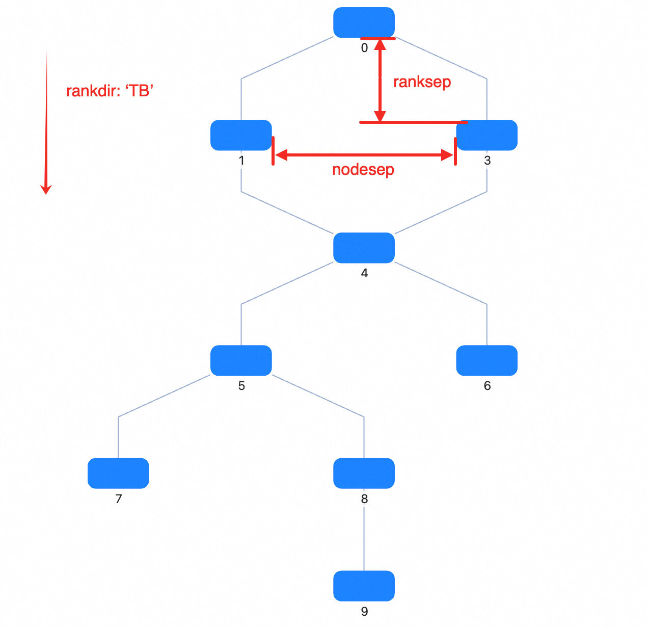
| rankdir | Layout direction, options | TB | BT | LR | RL | TB | |
| align | Node alignment, options | UL | UR | DL | DR | UL | |
| nodesep | Node spacing (px). For TB or BT, it's horizontal spacing; for LR or RL, it's vertical spacing. | number | 50 | |
| nodesepFunc | Callback for node spacing (px), allows different spacing for different nodes. For TB or BT, it's horizontal spacing; for LR or RL, it's vertical spacing. Takes precedence over nodesep. | (d?: Node) => number | ||
| ranksep | Rank spacing (px). For TB or BT, it's vertical spacing between ranks; for LR or RL, it's horizontal spacing. | number | 100 | |
| ranksepFunc | Callback for rank spacing (px), allows different spacing for different ranks. For TB or BT, it's vertical spacing; for LR or RL, it's horizontal spacing. Takes precedence over ranksep. | (d?: Node) => number | ||
| ranker | Algorithm for assigning ranks to nodes: longest-path, tight-tree, or network-simplex | network-simplex | tight-tree | longest-path | network-simplex | |
| nodeSize | Specify node size for all or each node, used for collision detection. If a single number is returned, width and height are the same; if an array, e.g. [width, height]. | Size | ((nodeData: Node) => Size) | |
| controlPoints | Whether to keep edge control points. Only effective when using built-in polyline edges (type: 'polyline-edge') or any edge that uses style.controlPoints as control points. Adds style.controlPoints to edge data. | boolean | false | |
| begin | Top-left alignment position of the layout | [number, number] | [number, number, number] | ||
| sortByCombo | Whether to sort nodes in the same rank by their parentId to prevent Combo overlap | boolean | false | |
| edgeLabelSpace | Whether to reserve space for edge labels | boolean | true | |
| nodeOrder | Reference array for node order in the same rank, stores node ids. If not specified, dagre's default order is used. | string[] | ||
| radial | Whether to use radial layout based on dagre | boolean | false | |
| focusNode | Focus node, only effective when radial is true | ID | Node | null | ||
| preset | Reference node positions for layout calculation, usually for smooth transitions when switching data. In G6, if updating data, the existing layout result is used as input. | OutNode[] |
DagreAlign Default:
UL
Node alignment: U = upper, D = down, L = left, R = right
UL: align to upper leftUR: align to upper rightDL: align to lower leftDR: align to lower rightDagreRankdir Default:
TB
Layout direction. T = top, B = bottom, L = left, R = right
TB: top to bottomBT: bottom to topLR: left to rightRL: right to left
network-simplex|tight-tree|longest-path
Layout mode
number Default: 50
Rank spacing (px)
For 'TB' or 'BT', it's vertical spacing; for 'LR' or 'RL', it's horizontal spacing. ranksepFunc has higher priority.
(d?: Node) => number
Callback for rank spacing (px)
For 'TB' or 'BT', it's vertical spacing; for 'LR' or 'RL', it's horizontal spacing. Takes precedence over nodesep if set.
number Default: 50
Node spacing (px)
For 'TB' or 'BT', it's horizontal spacing; for 'LR' or 'RL', it's vertical spacing. nodesepFunc has higher priority.
(d?: Node) => number
Callback for node spacing (px), allows different spacing for different nodes
For 'TB' or 'BT', it's horizontal spacing; for 'LR' or 'RL', it's vertical spacing. Takes precedence over nodesep if set.
[number, number] | [number, number, number] Default: undefined
Top-left alignment position of the layout
boolean Default: false
Whether to keep edge control points. Only effective when using built-in polyline edges (type: 'polyline-edge') or any edge that uses style.controlPoints as control points. Adds style.controlPoints to edge data.
boolean Default: true
Whether to reserve space for edge labels
This affects whether a dummy node is added in the middle of the edge.
ID | Node | null
Focus node, only effective when radial is true
string[] Default: undefined
Reference array for node order in the same rank, stores node ids
If not specified, dagre's default order is used.
Size | ((nodeData: Node) => Size) Default: undefined
Specify node size for all or each node.
Used for collision detection to prevent node overlap
OutNode[] Default: undefined
Reference node positions for layout calculation
Usually for smooth transitions when switching data. In G6, if updating data, the existing layout result is used as input.
boolean
Whether to use radial layout based on dagre
boolean Default: false
Whether to sort nodes in the same rank by their parentId to prevent Combo overlap
Recommended to enable when using Combo
The following documents can help you better understand the Dagre layout